Use the real mark.
This page is out of date and is being rebuilt. Do not take artwork from it today.
On 27 July 2026 the mark became three bores drilled through a graphite plate — the mark in the header above, and the one on avano.app, in the app, on both app stores and on our social cards. Every download link, swatch and rule further down this page still describes the mark before it: a lit disc, called the eclipse and then the moon here.
The masthead was moved because a brand page whose own header shows a retired mark is self-refuting. The gallery below it was not quietly patched, because a half-updated brand guide is more dangerous than an obviously stale one — a current header lends its authority to download links that still serve the old artwork. For the current mark, ask [email protected] and you will get the delivered set.
What follows is written to be pasted without us having to correct it later — but see the notice above: as of today the artwork and the mark-specific rules are the previous mark's, and only the colours, type and boilerplate still hold. Take what you need — no permission required for news coverage, reviews and commentary.
The current mark is the three bores in the masthead above, adopted 27 July 2026 — not the eclipse below. The gallery, swatches and download links further down this page still describe the previous mark, the lit disc called the eclipse, and have not been rebuilt yet. Treat that eclipse artwork as retired: please don't ship it. For the current three-bore mark, use the masthead lockup or ask and we will send the files.
Avano is pre-release. It is in active development and has not shipped to the App Store or Google Play. Please don't describe it as a released product.
The wordmark ships as a bitmap, not as vector, and we would rather say so than paper over it. The letterforms are Archivo 800, and turning them into outlines needs the font itself, which is not in this repository. Rendering the designer's live-type file here substitutes a different face — measured, the substitute's ink runs 7.21:1 against the real 6.80:1 and the two shapes overlap at 35% — so we ship the designer's own render instead of a convincing forgery. The icon is unaffected and is true vector. If you need the wordmark larger than what is here, ask and we will get it cut properly.
The mark, the wordmark, the lockup.
Each is shown here on the background it is drawn for. The icon is vector; everything with type in it is a bitmap, for the reason stated above — these PNGs are the designer's own approved renders, cropped to the ink and keyed to transparency, not re-typed and not re-spaced by us. Every pixel dimension quoted below was read back off the file after it was written.


Give it room. Don't shrink it past reading.
Two rules, both expressed in the artwork's own measurements so you never have to compute anything from our side.
Clear space
The designer states one rule and it is in terms of the disc: keep clear, on all four sides, at least half the disc's diameter. Nothing else may enter that band — no rules, no photo edges, no other logos.
Lockup: the disc is the tallest thing in the file, spanning its full height, so half the disc diameter is simply half the artwork's own height. Nothing to compute.
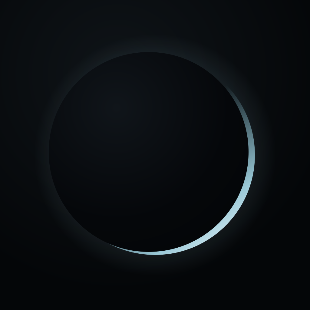
App icon: the disc does not fill the tile — the lit edge is drawn at r=330 in a 1024 box — so the same rule works out to 0.32 × the icon's width. Where a platform draws the icon itself, in a launcher, an app grid or a store listing, the platform's own padding is the rule and this one does not apply.
Minimum size
The icon has two thresholds and both are the designer's, not ours: below 40 px the bloom comes off, and below 24 px you switch to the pure white-on-black crescent. A soft halo and a subtle body gradient are the first things to disappear into a pixel grid, and what survives is the crescent — so at small sizes the crescent is all the artwork there is. We ship both variants; the swatches below are the actual files a browser would fetch at each size, not one file scaled down.
Wordmark: 90 px wide. Lockup: 150 px wide. Both were re-measured against this mark rather than carried over — the previous numbers on this page described a tracked serif that no longer exists here. Archivo 800 is a much sturdier face and the wordmark still resolves at 70 px; 90 is where it stops looking cramped. The lockup's floor is higher and the disc is why: shrink it and the crescent thins to nothing long before the letters do, leaving a dark blob beside a word.
Where you have less than 150 px of width, use the wordmark or the icon alone — never the lockup. A lockup too small to read is worse than no lockup.
Two palettes, and which one you want.
These are read out of the designer's specification and this site's stylesheet, not sampled off a screenshot. If you need a colour that is not here, we don't have one.
The mark's four colours
This is the brand palette proper — what the eclipse is made of. Reproducing the mark uses these and nothing else.
The website's ten
Separate from the mark, and not interchangeable with it: this is what avano.app is built out of. Quoted because journalists ask, not because the logo uses them.
The icon is four gradients, not a flat fill. Read straight out of brand/avano-icon.svg rather than sampled: the plate is a radial #0F1418 → #040608; the disc's body is a radial #10151A → #05070A → #040608; the lit edge is a linear #8FCEE0 at zero opacity → #A9DCEB at 0.9 → #F0FAFF; and the bloom is #A9DCEB falling from 0.2 to nothing. The old shield's #e2edfe → #a8c0e6 → #6d86a6 is gone with the shield — if you have it written down, it is stale.
The disc is drawn twice, offset. The body circle sits up and to the left of the edge circle by about 6.5% and 3.2% of the radius. That offset is the entire mark: it is what leaves a crescent on the lower-right instead of a ring all the way round.
#040608 and #06070a are both real. The mark's Obsidian is #040608; the website's background is #06070a. Two digits apart, and deliberate. Neither is a typo, so please don't normalise one into the other.
Three faces. Two loaded, one not.
This is what the site requests, not what a brand book wishes it requested — the stylesheet link below is copied from the page you are reading. The third face, the wordmark's, is the one this site never loads at all.
Nothing remains.
Roman 400 & 500 · Italic 400 & 500
Optical size axis 6–72
Headings and body 400 · italics for emphasis
Stack: 'Newsreader', Georgia, serif
METADATA-MINIMIZING
400 & 500
Labels, eyebrows, buttons, footnotes only — never body copy
Uppercase, letter-spacing .12–.22 em, .55–.7 rem
Stack: 'JetBrains Mono', ui-monospace, monospace
The wordmark only. This site does not load it.
scale(1.15, 0.80) · tracking −0.075 em
Descriptor, where one is used: JetBrains Mono 400, tracking 0.42 em
Do not set "Avano" in live type, in any face, including Archivo. The wordmark is Archivo 800 compressed and re-tracked — install the font, type the word, and you get the right letters at the wrong proportions, which is worse than an obvious substitution because it looks deliberate. Place the supplied file.
We follow our own rule here, and it cost us the header: this page's masthead used to be the word "Avano" set in Newsreader. It is now the lockup file, because a serif "Avano" beside an eclipse is precisely the mistake section 05 is about. The failure mode is silent either way — a browser without the face quietly serves Georgia and nobody notices.
Five ways to get it wrong.
None of these are hypothetical — they are what happens to a logo left to fend for itself.
Use the supplied file, unmodified, on a dark background, with its clear space respected.
Scale both axes together. Never stretch, squash, rotate or skew — the letterforms are drawn, not typed.
Two fills exist: light and inked. Those are the two. No brand colours of your own, no gradients, no single-colour knockouts we didn't supply.
No glow, no drop shadow, no outline, no bevel. The crescent is the only light in the mark and it appears exactly once — adding a second source is the fastest way to stop it reading as an eclipse.
The dark lockup is Platinum type over a disc that is deliberately transparent on its dark side — on a pale surface half the mark is simply not there. On light backgrounds take the inked file, and never place either version over a busy photograph.
This is "Avano" in Georgia — what you get when the wordmark is retyped rather than placed. Close enough to look intentional, wrong in every letter. This page shipped exactly this mistake in its own masthead until the eclipse landed.
Text you can paste. Please paste it.
Three lengths, all accurate as of today. We would much rather you used our words than approximated them — the approximations tend to be stronger than the truth, and we have to live with the difference.
Avano is a metadata-private messenger: no phone number, no email, and no metadata to subpoena.
Avano is a metadata-private messenger for people whose adversary is a state, not an advertiser. There is no phone number, no email and no account — your identity is a key on your device. Messages are end-to-end encrypted and routed over Tor to RAM-only relays that hold nothing to subpoena.
Avano is a metadata-private messenger. Encrypting what you say is a solved problem; what most apps still leak is who you talk to, how often, and when — the map of a whole life. Avano is built to minimise that pattern by design. There is no phone number, no email and no account: your identity is a cryptographic key generated on your device, and you add a contact with a single-use invitation link. Messages are end-to-end encrypted with unmodified, audited cryptography (libsignal), carrying post-quantum protection on both the key exchange and the ongoing ratchet, and they travel over the Tor network to relays that hold sealed, same-size packets in memory only — nothing written to disk, nothing persistent to seize. Avano is metadata-minimising, not "invisible" or "untraceable", and it publishes its limits rather than hiding them: it alerts you the moment mail lands and uses no push service to do it, so no third party learns when you receive — but nothing reaches you once iOS has terminated the app, or while an Android phone is locked; it has not had an independent third-party security audit; and its source, licensed AGPL-3.0, is not yet published. Avano is early-access software; described capabilities marked planned or in progress are not available today. Avano is published by Aere Network.
- metadata-private · metadata-minimising
- no phone number, no email, no metadata to subpoena
- end-to-end encrypted, with post-quantum protection
- routed over Tor to RAM-only relays
- pre-release, in active development
- untraceable
- invisible
- unbreakable · unhackable
- 100% anonymous
- NSA-proof, or any named-adversary claim
The published threat model and a public source repository. This site states that both go public at launch, and today neither is at a URL we can give you. If a claim on this page or on our homepage matters to your piece, write to us and we will answer it specifically rather than let you infer it.
Don't describe features from our marketing as shipped. Some of what the homepage presents as design goals is not finished — disappearing-message timers, for one, are wired on one platform only and have not been verified running on a physical handset. Ask us what state a specific feature is in; we will tell you, including when the answer is unflattering.
Ask us. We'd rather be checked.
Journalists & researchers
Interviews, background, fact-checking, or a copy of an asset in a format that isn't here. We would rather you got it right than got it fast.
[email protected]General
The front door — product questions, early access, or anything that isn't a story. This is the address already published on our homepage.
[email protected]What you may do with all this.
Avano and the Avano mark are trademarks of Aere Network. They are unregistered. We have neither applied for nor been granted a trademark registration, so there is no ® to add — please don't add one, here or anywhere else.
You may use these assets, unmodified, to illustrate news reporting, reviews, research, and commentary about Avano. That is what this page is for and you do not need to ask.
Please don't use them to imply that we endorse, sponsor, or are partnered with you; incorporate them into your own logo, product name, app icon, or domain; or alter them in any of the ways set out above. If you are unsure whether your use is fine, it almost certainly is — but [email protected] will confirm in a sentence.
Screenshots of the app may be used freely in coverage. If a screenshot shows a feature, please check with us first that the feature is finished — some of what you can see in our own materials is a design goal rather than shipped code, and we would rather correct that before publication than after.